What Copy Should Go On Your Checkout Pages
APPLE PODCASTS | SPOTIFY | YOUTUBE
Funnels 101, Lesson 4: Checkout Page Copy
Checkout pages are often treated as a technical necessity rather than a strategic asset. Many businesses focus heavily on driving traffic, optimizing opt-in pages, and refining sales emails, only to reduce the checkout experience to a basic payment form.
This is a mistake.
The checkout page is the final decision point in the funnel, and it plays a critical role in reinforcing trust, reducing friction, and increasing overall revenue. When optimized thoughtfully, a checkout page does far more than process payments. It deepens commitment and can significantly improve conversion rates and average order value.

The Primary Role of a Checkout Page
A checkout page exists to help a buyer complete a purchase with confidence. At this stage, the goal is not persuasion or education. Those jobs should already be done. Instead, the focus shifts to reassurance, clarity, and ease.
Distractions at this point are costly. Introducing new ideas, explaining what the offer is not, or overwhelming the buyer with excess information can create doubt and hesitation. The most effective checkout pages are intentionally minimal, guiding the buyer smoothly toward completion.
What Must Be Clear Before Payment
Every checkout page should immediately confirm three things:
First, the buyer must know exactly what they are purchasing.
The name of the product or service should be clearly displayed, along with a brief reminder of its purpose or outcome. This reduces uncertainty and confirms that the buyer is in the right place.
Second, pricing and payment options must be transparent.
If payment plans are available, they should be clearly outlined. Ambiguity around cost is one of the most common causes of abandoned checkouts.
Third, the page should quietly reinforce the value of the purchase.
This is not a full sales argument, but a concise reminder of the transformation or result the buyer expects to achieve.
Building Trust at the Point of Purchase
Checkout pages are where buyers are most sensitive to risk. Visual and textual trust signals matter more here than anywhere else in the funnel.
Security indicators, recognizable payment icons, and confirmation that personal information is protected all help reduce anxiety. Including a short testimonial or outcome-focused statement can further validate the decision to buy.
Guarantees are optional and should be used thoughtfully. For digital products and services, outcomes are not always controllable, and blanket refund policies can undermine perceived value. The decision to include a guarantee should align with the business model and delivery method.
Layout, Design, and User Experience
Copy contributes to your overall user experience. A checkout page that feels confusing or broken sends an implicit message that working with the business may feel the same way.
Most effective checkout pages use a simple two-column layout. One side reinforces the offer and its value, while the other side handles the transaction itself. This structure keeps the buyer oriented while completing the form.
Mobile optimization is essential. A significant portion of purchases happen on phones, and any friction in the mobile experience can lead to lost revenue. Testing the checkout flow across devices is a necessary step in funnel optimization.
Subtle progress indicators can also improve completion rates. A simple visual cue that the buyer is “almost there” helps maintain momentum and reduces abandonment.
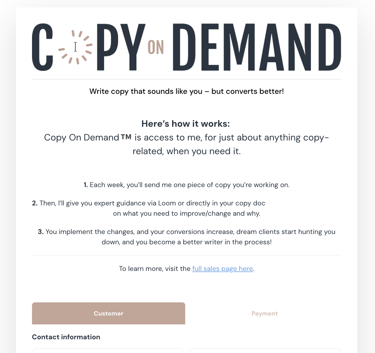
You can see an example of one of my checkout pages here:
Increasing Order Value With Strategic Add-Ons
Checkout pages present a natural opportunity to increase average order value through order bumps or add-ons. When done correctly, this feels like helpful guidance rather than aggressive upselling.
An effective order bump solves the next logical problem the buyer will face after purchasing the core offer. It should be closely related, immediately useful, and clearly framed in terms of added value.
When aligned with the buyer’s intent, order bumps strengthen brand perception and enhance the overall customer experience while increasing revenue.
The Bigger Picture
At its core, a checkout page should confirm the purchase, reinforce trust, and make completion easy. When those fundamentals are in place, additional optimizations can elevate both conversion rates and brand credibility.
Checkout pages are not just forms. They are the final trust checkpoint in a funnel, and when treated strategically, they become one of the most powerful revenue drivers in a business.
Helpful Resources:
Other Funnels 101 Episodes
Connect with me here:
Watch episodes with subtitles on my YouTube
See my services → sales pages, emails, websites, and more.
Opt-In Copy Bot → Write high-converting opt-in pages in minutes
Watch episodes with subtitles on my YouTube
Nomad Copy Agency writes copy that CONVERTS for service-based businesses. Inquire about done-for-you services here.